WWE Network: Native apps
As Senior UX and UI Designer at Massive Interactive, I owned the UX of the iOS and Android apps for WWE Network 2.0, WWE's live and on-demand service rebuilt on Massive's AXIS platform.
Context
WWE Network combined a 24-hour linear channel, the weekly shows and pay-per-view events with an on-demand library, in the same app as WWE’s news and results. Anyone could browse the app and watch short-form video and the pre-shows of live events, and the rest needed a subscription.
Massive specified Network 2.0 separately for the native apps, responsive web and TV. I covered iPhone and iPad, and Android phones and tablets, using AXIS modules wherever WWE’s content fitted them and offering alternatives WWE could agree to where it did not.
Setting out the IA
The engagement opened with two days of client workshops in Connecticut in May 2018, followed by concept decks in June. On 13 July I shared a native document for review, with the site map, breakpoints, grids and tiles, native navigation for iPhone and Android, and two options for the home feed.
In the site map, v1.0 of 4 July, I put WWE’s programming under a Watch tab, from Featured and the pay-per-views to Raw, SmackDown, NXT, In Ring, Originals and the schedule. One player and detail page had variants for pay-per-view episodes, Originals episodes, clips and playlists.
Site map, v1.0, 4 July 2018. By v1.1 of 20 November, Watch had become Network. My List and the list pages had sections of their own, and playback was split into VOD, live, no video, Chromecast and AirPlay flows.
Choosing a native home feed
The Home tab showed WWE’s editorial feed of news, galleries, clips and playlists, and in July I put two ways of building it to review. The first loaded wwe.com’s home page in a webview, without the site’s header and footer. Each link opened a full-screen webview, and we agreed in review on a Close button in its top bar, to set it apart from the browser’s Back button at the bottom. I noted the assumption that any page opened from the feed, WWE’s own included, would keep its site header and footer inside the app, and asked for a correction if it was wrong. The second option rendered the feed in the app from a data source such as a JSON feed, and opened its links in a separate webview.
Option 1, webview, July 2018. The wwe.com page inside the app shell, above the five tabs of July: Home, Watch, Superstars, Search and More.
Option 2, native, July 2018. The feed drawn in the app, with Read more and Full bio actions on the hero story and a WWE News list below.
In August articles still opened in a webview, now without browser navigation and with only a Back action to the previous app state, while superstar bios and videos opened natively.
By November articles and galleries rendered natively from WWE’s feed, and videos and playlists opened in the app’s player. Only external links left the app.
In both the November and January exports, the home feed is marked as in the backlog.
01Design
Designing for four device classes
In P1 I drew each page for the four device classes, and for both orientations where the layout changed, on grids and tile rows set for each class. Navigation followed each platform, with links to Apple’s and Google’s guidelines on the page. iPhone and iPad used native tab bars, and the Android bottom navigation replicated them on specs from Massive’s UI team. Sections with several shows, such as Network, used scrollable tabs along the top, and the More menu was a table view on iOS and a list on Android.
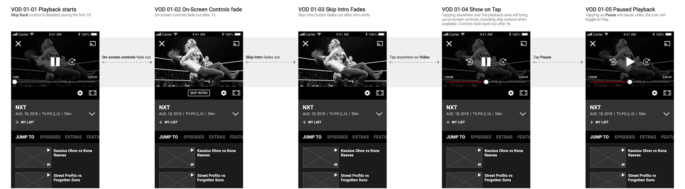
I also specified playback for every device class, with Chromecast sender flows for Android and iOS and the receiver, AirPlay as Apple’s standard flow, and a limit on concurrent streams that paused the oldest stream first.
Network, Featured, in three layouts. Each row is numbered against the tile type it uses. The note in red says the page is only an example, since WWE could change page presentation and target it by audience in Presentation Manager.
How the sprints ran
Delivery ran in ten sprints, and each week I reviewed the work with WWE’s product and design teams and Massive’s product team. Each flow in the Axure spec has a code, LOG for sign in and CWA for account creation, and each screen a number within it, such as LOG 01-02 for the email field in focus. When WWE changed the sign-up flows through a change request, I kept the previous diagrams in the spec as v1 and linked them from the new ones, as the reference for testing.
Drawing the sign-up and upgrade journeys
Access depended on four user levels: an anonymous user (L1), a free account (L2), and the Premium (L3) and VIP (L4) subscriptions. I mapped twelve journeys in the sign-up and upgrade diagrams, each from a user level and an entry point, such as the first launch, the More menu or a locked video, to a goal level. Across the app, a locked item showed Upgrade to watch in place of Watch and opened the journey for the user’s level.
Only a Premium subscriber who had paid through the app’s own store could upgrade to VIP in the app. Subscribers who had paid on the web, by card, PayPal or prepaid card, or through another store were referred to the web to upgrade.
Sign up and upgrade diagrams. Green flags mark the goals, a free account or a Premium or VIP subscription paid for in the app, and every route from an anonymous user reaches account creation before any payment.
Branching the flows for TV Everywhere
In the November state, TV Everywhere was one page and a link on the sign-in screen for customers subscribed through a TV provider, with a note that Adobe Primetime authentication worked only in Canada and the Middle East. By early December WWE had raised a change request, as a Jira ticket, under which customers in those regions could join Premium only through their TV provider.
I branched the Rest of the World flows into a TVE branch in the same spec, reusing as many flows and screens as I could, and colour-coded each flow in the branch as unchanged, slightly changed, significantly changed or new to TVE. In the branch, a native list of providers led to the provider’s own sign-in in a webview under a bar with a Cancel button, and a success token then granted Premium or left the user browsing on a free account. VIP content, which no one in those regions could buy, showed a message that it was not available there. For the same request I added a Create account link to the sign-in screen, and asked for it in both branches to keep them consistent.
Acquisition flows, RoW and TVE. In the RoW index, red marks the flows with no TVE equivalent, from plan selection and Subscribe to the VIP upgrades and both in-app payment flows.
Designing the metadata blocks
Section 03 of the spec is the component library, from forms, error views and snackbars to modals, selects, a sort panel and a bottom sheet, most drawn for phones and for tablets in both orientations. In section 06 I set out WWE’s catalogue as three blocks, the metadata box on detail pages, the hero and the tile, each by content type.
The heroes matrix covers twelve types, from weekly and legacy In Ring shows to Originals, pay-per-views, clips, shows, playlists, superstars and promos, in their default, On Now and Live Now states. The Watch button reads Watch, Resume for a partly watched video longer than ten minutes, Upgrade to watch without the entitlement, or Preview for an event coming up. Tiles follow the same types, with states of their own for news and photos, the schedule, continue watching, now playing and watched.
Heroes matrix. The annotations fix the formats as well: duration as 1h 58m on heroes and 2:56:20 on tiles, air dates as AUG. 18, 2018, and language availability only where a video has two or more audio tracks.
02Handover
Writing the spec for UI and development
For the handover I documented every screen and behaviour variant for Massive’s UI designers and the developers, by device class and orientation. Where a layout was the UI team’s call, I said so on the page, marking the tablet columns of the schedule and the edit mode list as recommendations, and leaving the final styling of search, transparencies included, to the UI team. On each component page I noted its behaviour and where it is used. Error views, for example, fade when the user taps close or anywhere outside, and appear in the sign-in, reset and sign-up flows.
Error views, from the component library. A dismissable alert for a failed sign-in and an inline alert for a lost connection, with the column grid overlaid on the tablet layouts.
Outcome
By my account in 2020, the native journeys were the base for the other platforms’ UX documents and for the native UI. By the same account, the app that went live did very well on conversion and in app store feedback, with ratings up on both stores.
The native spec grew from the 18 pages I shared for review in July 2018 to 181 in the P1 export of 21 November. The phase 2 production spec of 30 January 2019, a month before my contract at Massive ended, runs to 217 pages, with offline downloads for Premium and VIP subscribers as its new section.
Contact
Get in touch
Product design lead across research, design systems and handover, with coding agents in the loop. Contract, outside IR35, or a permanent lead role.
- Available
- Now
- Location
- London, remote or hybrid, UK and EU
- Right to work
- UK settled status, EU citizen
- RolesLead Product Designer, Principal Product Designer, Design Engineer
- Experience10+ years
- ScopeResearch, design systems, prototyping, handover, QA with agents
- LanguagesEnglish, Italian, Spanish
- Email[email protected]
- LinkedInlinkedin.com/in/dariocodipietro
Professional profile
Copy into your coding agentSkills
- Product design, end to end
- UX and interaction design
- Visual design and motion
- Prototyping in Figma and code
- Design systems at scale
- User research and testing
- A/B testing and analytics
- Strategy and discovery
- AI product design
- Design to code, with agents
- Accessibility, WCAG 2.2 AA
- Leadership and mentoring
Platforms
iOS, Android, responsive web, smart TV and connected devices
Sectors
- AI products
- B2B SaaS
- Consumer apps
- Streaming, media and sport
- Health, wellness and food
- Legal tech
- Telecoms and utilities
Tools
- Figma
- FigJam
- Figma Make
- Claude Design
- Framer
- Axure RP
- Storybook
- Claude Code
- Cursor
- Codex
- MCP
- GitHub
- Linear
- Jira
- Confluence
- Notion
- Miro
- Prolific
- Lyssna
- Maze
- PostHog
- Amplitude