Utility Warehouse: Partner app onboarding
As Lead UX Designer at Utility Warehouse, I designed onboarding for new partners in the UW Partners app over a six-week Shape Up cycle, to keep more of them active through their first year.
Context
UW’s growth plans relied on its self-employed partners, who find customers for its energy, broadband and mobile services and sign them up. In the pitch for this cycle, the large majority of new partners had stopped within a year, most of them during onboarding.
Marketing had found the onboarding poor, with every new partner put through the same complicated process whatever their life stage, demographics or ambition. Partners already used the UW Partners app heavily, despite its technical limits, and we took it as the entry point for a better onboarding.
Scoping the cycle
This was a six-week cycle in Shape Up’s R&D mode, the team’s first in the format. Alongside UX it had data and tech tracks, for analytics across partner touchpoints and for the app’s technical limits. The pitch listed the partner channel’s problems, among them treating every partner the same and capturing too little data, and the question was which lever would unlock the most value in the next quarter. In its projections, onboarding came first as activation, with retention and then acquisition modelled on top of it.
Within the six weeks I planned up to three UX concepts in two-week iterations, and the no-gos limited the cycle to the app and to a partner’s first steps after signing up. Deliverables were due by 6 November, concepts by 20 November, and refinement, iterative testing and the final annotated journeys and prototypes by 4 December.
Auditing the onboarding baseline
Marketing’s analysis of the onboarding set out its stages, from a warm welcome and an introduction to the Partner Portal to training and the partner community, with an example flow of emails, a welcome letter by post and a portal reminder over a partner’s first seven days. Its best-practice examples were onboarding emails from Indeed, Casper, AWS, Airbnb and others, and its concepts for UW were modules for a welcome email, from a product introduction to a timeline of first steps.
In my notes on the board, most of the examples gave signed-up users several actions for their different needs, and only Casper and KISSmetrics led with one. Marketing’s concepts would suit a landing page better, since a partner in the app has already signed up and needs actions for activation, engagement and recruitment.
For the app itself I ran a competitive audit of onboarding and gamified learning in consumer apps such as Duolingo, Headspace, Fitbod and Robinhood, grouped by pattern: sign-ups that ask one question at a time, segmenting, native permission prompts, and progress, badges and streaks. Airbnb’s host onboarding was the reference for start-up facilitation, with notes on partner needs such as duplicating existing applications and help with quotes.
Competitive audit, the Segmenting frame. Goal pickers above, and below them permission prompts that say what the app will send before the system alert appears. The same frame also covered commitment, experience and start-up facilitation.
Adding partner profiling
In marketing’s baseline every partner followed the same sales journey, and profiling was missing. I added partner profiling to the UX scope of the cycle, as the basis for sales journeys that differ at least by commitment appetite.
The two product managers were to shape those journeys by the week ending 6 November. My part was designing the questions that would place each new partner on one.
The profiling mind map on the board covers goals, commitment appetite, demographics, job, life stage, attitudes and motivations, and how a partner prefers to be contacted. The onboarding steps on the board, linked by arrows to the audit’s columns, are profile, goals, commitment, kickstart and native permissions, with experience struck out. Financial goals were proposed in a separate note, to help partners kickstart the business and to show how many had unrealistic expectations, a possible cause of drop-off in the first year.
01Iteration one
Passwordless sign-in
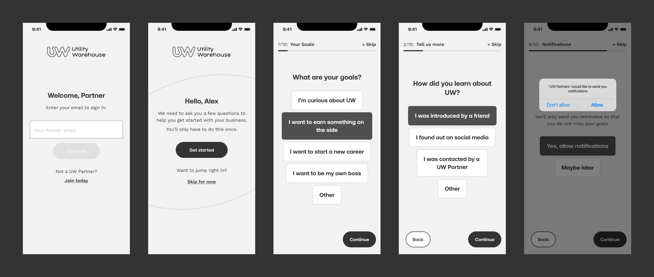
The first iteration, a Figma file named Iteration 1, has 36 iOS screens in three groups: sign-in, onboarding and the landing screen. A partner signs in with their email and a four-digit one-time code sent to it, with a countdown to its expiry and a link to send it again. A welcome screen then explains that the app asks a few questions, only once, to help the partner get started with their business, and offers Skip for now.
Iteration 1, the Flows page. The four rows beneath the start of the onboarding are branches, one for each of the other answers to the goals question. Most questions appear twice, before and after an answer is chosen.
Open in Figma ↗ Get password →The profiling questionnaire
The questionnaire asks one question per screen, under a stepper that counts to ten with a skip link on every step, and the answers are chips above back and continue buttons. The file holds the first eight steps: goals, a follow-up, what the partner liked about UW, their current situation, how much they would like to earn, the hours a week they will put in, how long they give themselves to reach their goal, and notifications. Most of them map onto branches of the mind map.
The second step changes with the answer to the first. A partner who is curious about UW is asked how they heard about it, one who wants to earn on the side how much they would like to earn next year, and one who wants a new career or to be their own boss about their current situation. A partner who picks Other writes their goals in their own words.
Iteration 1, step two. The step title stays Tell us more in every version, and the free-text sheet opens over the questionnaire with its own back and continue.
Open in Figma ↗ Get password →Steps six and seven ask for the commitment appetite the sales journeys were to be linked to, in hours a week and in time to reach the goal. Step five asks about earnings, the financial goal from the note on the board.
Step 6, hours a week. From up to two hours to full time.
Open in Figma ↗ Get password →Step 7, time to reach the goal. From three months to three years or more.
Open in Figma ↗ Get password →At step eight the app primes the notification permission on its own screen, “We’ll only send you reminders so that you do not miss your goals”, before the iOS prompt appears. No answer is required anywhere in the questionnaire, from Skip for now on the welcome screen to Maybe later at this step.
Before the questions. With Skip for now, a partner goes past all ten steps.
Open in Figma ↗ Get password →Step 8, notifications. The iOS alert opens over the app’s own ask, which stays visible behind it.
Open in Figma ↗ Get password →The partner dashboard
In a concept wireframe filed with marketing’s concepts on the board, the rest of the app stayed locked until a new partner had done the mandatory training and signed up three customers. In the audit I had noted that one call to action to unlock the dashboard would leave a partner a single thing to do, and that AWS keeps several actions open beside its stepper. The landing screen in Iteration 1 has points and a star badge beside the greeting, a summary line, and the partner’s appointments, reminders and classes above a tab bar for Home, Learn, Plan, Promote and More.
Iteration 1, the landing screen. Each list has its own add button, and four of the five tab icons are still placeholders.
Open in Figma ↗ Get password →02Components
Building the component library
The screens are built from a component library on the file’s Assets page, organised as atoms, molecules and organisms, with light and dark variants of most of them. The question organism, with or without a description line, is reused on every step, and the stepper has a state for each of the ten steps. The pager, text field and answer chip are drawn in each of their states, and the iOS status bar, keyboard, alert and notification banner are components too. The palette is black, white and greys throughout.
Iteration 1, the Assets page. Layer names follow the same structure, from App/Atoms/Button to App/Organisms/Tab Bar, and all six chip states use the copy of the first answer.
Open in Figma ↗ Get password →What was left out of the cycle, and what was designed
Out of the cycle
- Onboarding in the Partner Portal
- The partner sign-up process
- The partner journey past core onboarding
- Changing a goal once it is set
- Experience as a profiling step
In Iteration 1
- Passwordless sign-in by email
- A skippable questionnaire on a ten-step stepper
- A second step that branches on the partner’s goal
- Notification priming before the iOS prompt
- A landing screen with points, appointments, reminders and classes
- A component library in light and dark
The first four were no-gos in the pitch, and experience was struck from the list of onboarding steps on the board.
Outcome
Iteration 1 was due to be presented to stakeholders by 4 December. I have no figures for partner retention after the cycle.
Iteration 1 lets a partner skip every question, and the sales journeys the product managers were shaping would depend on the answers.
Contact
Get in touch
Product design lead across research, design systems and handover, with coding agents in the loop. Contract, outside IR35, or a permanent lead role.
- Available
- Now
- Location
- London, remote or hybrid, UK and EU
- Right to work
- UK settled status, EU citizen
- RolesLead Product Designer, Principal Product Designer, Design Engineer
- Experience10+ years
- ScopeResearch, design systems, prototyping, handover, QA with agents
- LanguagesEnglish, Italian, Spanish
- Email[email protected]
- LinkedInlinkedin.com/in/dariocodipietro
Professional profile
Copy into your coding agentSkills
- Product design, end to end
- UX and interaction design
- Visual design and motion
- Prototyping in Figma and code
- Design systems at scale
- User research and testing
- A/B testing and analytics
- Strategy and discovery
- AI product design
- Design to code, with agents
- Accessibility, WCAG 2.2 AA
- Leadership and mentoring
Platforms
iOS, Android, responsive web, smart TV and connected devices
Sectors
- AI products
- B2B SaaS
- Consumer apps
- Streaming, media and sport
- Health, wellness and food
- Legal tech
- Telecoms and utilities
Tools
- Figma
- FigJam
- Figma Make
- Claude Design
- Framer
- Axure RP
- Storybook
- Claude Code
- Cursor
- Codex
- MCP
- GitHub
- Linear
- Jira
- Confluence
- Notion
- Miro
- Prolific
- Lyssna
- Maze
- PostHog
- Amplitude