DAZN: Navigation v2
As Senior Product Designer at DAZN, I designed the second generation of its navigation and content discovery, to move the service from the menu it launched with to each platform's own patterns, with the native apps first.
Context
Navigation and browse in DAZN’s first release came from a creative agency’s deliverables. In the release spec, the schedule, every sport, the account and help sat in one overlay menu opened from the header. In usability testing in Japan in March 2016, most participants did not notice the menu, and they found the list of sports only by scrolling to the last rail of the home page. Users in testing also expected the navigation on phones and tablets to follow the device’s own interface.
Following and downloads were due to be added after launch, along with a new schedule, and the navigation already differed from one platform to the next. The goal was a consistent navigation across every device DAZN ran on, with room for the new features.
01Discovery
Sorting the information architecture
I gathered what was wrong with the live navigation from alpha testers’ feedback and user test sessions, then ran an open card sort and tree tests with users. The card sort fell into four clear areas, Watch, Preferences, Account and Support, which I organised as a labelled tree with Watch as the main focus. Users need legal pages, language settings and help only at specific moments, so I kept them out of the Watch experience, with help still offered in context when a problem came up.
From the card sort and the data we had, we ranked three user priorities, with engaging content first, managing the account and getting help second, and the legal pages and SEO last.
Open card sort, the labelled tree. Each area has its own proposed subdomain, from watch.dazn.com to help.dazn.com, and the Account cards run from editing an email address to redeeming a gift code.
User priorities, July 2016. The four items under Watch are the four tabs of the first iPhone concept, with More for everything else.
Benchmarking navigation in top-rated apps
To see what navigation people were used to on their phones, I benchmarked 20 of the top free apps in the App Store, all rated 4 stars or more on both stores, along with their Android versions and mobile websites. Most of the iOS apps, 12 of the 20, used a tab bar, usually at the bottom of the screen, while most Android apps used a burger menu and put any tabs at the top. Seven of the 20 had no mobile website. DAZN’s apps, like Netflix’s at the time, used burger menus on both platforms.
I drew three concepts that applied these findings to iOS, Android and the web at phone size, and we ran quick concept tests on them as prototypes.
Best experience by platform, July 2016. Video is better on a large display, so TV and the responsive web at medium to extra-large sizes rank first and the mobile web last.
Making the case for native apps
On a phone, users tend to engage more with a native app, since it saves them opening a browser, typing the address and signing in before they can watch.
In the design team’s review for the senior leadership team in July 2016, I recommended a native-first strategy on mobile, concentrating resources on the native apps even at the expense of the mobile web. Each platform would get its own navigation, a bottom tab bar on iOS and top tabs or a burger menu on Android.
The leadership team accepted the case and hired in-house native developers, who built the new apps on a separate branch.
02Design
Navigation by platform
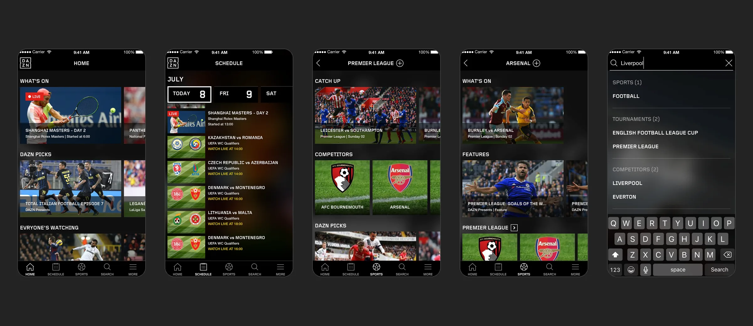
By September 2016 the concepts had become one structure with a pattern for each platform. The iPhone design had a bottom tab bar with Home, Schedule, Sports, Downloads and More, and the Android design kept a burger menu, with Home, Schedule, Sports and Downloads as tabs at the top. On the web at phone size a drawer held the account, settings, help and legal pages, and on larger screens they moved into a My DAZN menu at the right of the top bar. Sports had taken the place of Following as a tab, and led from the list of sports to each sport’s leagues.
Navigation, September 2016. The web at phone size, then the home of each native app. By December, Downloads was held for a later release and Search had taken its place in the iPhone tab bar.
In the final iPhone and iPad designs of December 2016, Sports leads to a sport, then a tournament, then a team. Each of those pages shows its live and catch-up events, DAZN’s picks and a rail for the level below. Search groups its results by sport, tournament, competitor and event. More holds settings, the account, help and the legal pages, the second and third priorities, away from Watch. I tested the navigation in guerrilla sessions and with alpha testers before its release on iOS.
First release spec, the menu at phone width. In the spec’s worst case, every sport, team, competition and athlete a user follows is listed above the full list of sports.
Navigation v2, the Sports tab on iPhone. The tab bar stays on screen at every level below, from a sport down to a team.
Tiles for every event state
Downloads needed the same tiles as the home page, so while designing it I took on the problems users kept raising with them. The first release’s tile stacked several boxes, repeated dozens of times on every page. Coming-up and catch-up events differed only by a subtle colour code. A date was two pairs of digits, so 02 03 meant 2 March, and long titles were cut off by a label of fixed height. In testing, users also could not tell whether the time on a tile meant the start in Japan, the local start or the length of the match, and labels such as Catch up confused them.
The new tile component puts fewer, more flexible data points over a 16:9 image: the competition and a time relative to today, then the event, then its state in words, such as Live in 20 mins, Highlights available, Catch up available on Sunday 21 or Postponed. The same component has a state for each stage of an event, from coming up to live, catch up and highlights, and variants for mobile, desktop and downloaded videos. It did well enough in testing and internal workshops to replace the original tiles across the service, on every platform.
Tile states, July 2016. The labels are set at one moment, Friday 12 at 15:40, and run from catch up at the top to coming up at the bottom. The options dots stay visible on touch screens and appear on hover on the web.
03Release
Handing over navigation and tiles
The native apps were built in Poland, and the web and TV in the UK. There were no design sprints, so I worked with the teams through reviews, test sessions and time on site.
For the developer handoff in January 2017, I prepared the responsive web at five breakpoints, from the home page through Sports to a team page, a first pass at the TV home and player, and the tile specs for iPad. The specs set tile sizes by screen width, with one full tile in view on a phone and two or more from 600 points.
Developer handoff, January 2017. Breakpoints 1 and 2 of the responsive web, from home through Sports to Football, the Premier League and Arsenal. At the largest breakpoints the tabs move into a top bar with menus for sports, tournaments and competitors.
In June 2017, after the Android v2.0 build, I specified UI fixes to fonts, margins and tile sizes for every Android phone and tablet. For Android v2.1 I moved the tabs to the bottom of the screen, as on iOS, in line with Material Design’s bottom navigation.
By the handover in September 2017, I had split navigation and tiles into separate Sketch files, with every tile component in one place. With tiles inside the navigation files, every tile change would have meant updating the navigation for web at three breakpoint groups, iOS, Android and TV. Tiles in the navigation files were left blank, since Android developers updating the schedule had built an old tile design that the schedule file still showed.
Each project had its Sketch file, an InVision prototype and its screens in Zeplin, indexed by device. By then both native apps had the second version of the tiles, and v2.1, without the black background under the labels, was implemented on Android and in progress on iOS.
Testing the live app in Japan
After release we kept testing with users, either existing customers or, in a new market, people from its likely audience. In July 2017 we ran research in Japan, testing the live iPhone app, version 2.0.4, against two newer iterations built as InVision prototypes.
Once the first native app was out, users asked for a way to browse the schedule of events and filter it by sport. After designing and testing the schedule on the apps, I tested its sports filter on site in Japan, with four or five Japanese users per session and a Japanese-speaking product owner, and changed it between sessions through the week. The flow had to let users find the filter from the schedule, apply one or more sports, cancel a change, clear every filter, and go back to the schedule as they last saw it. Testing in Japan also let us check the use of Japanese fonts.
The live iPhone app in Japan, July 2017. A capture from a test device. The tabs read Home, Schedule, Sports list, Search and More, and the rails What’s on, DAZN recommends and Popular content.
Sports filter, Japan. Across these versions Apply moved from the top bar to a full-width button, Cancel became a close icon, and Remove filter moved up into the top bar.
Outcome
Navigation v2 went live on iOS first, with the new tiles, and got excellent reviews on the App Store. That feedback led DAZN to roll it out to Android and then to the responsive web. As I recall, ratings on both app stores rose from roughly 3 stars to 4 or more after its first release.
In 2016 Netflix put its phone navigation behind a burger menu, and DAZN had followed it in its first release. Moving the iPhone app to a tab bar went against that reference, on the evidence of the benchmark and the March 2016 testing. After the rollout I moved to NFL Game Pass International, a white label of the main product, built on the same navigation and tiles.
Contact
Get in touch
Product design lead across research, design systems and handover, with coding agents in the loop. Contract, outside IR35, or a permanent lead role.
- Available
- Now
- Location
- London, remote or hybrid, UK and EU
- Right to work
- UK settled status, EU citizen
- RolesLead Product Designer, Principal Product Designer, Design Engineer
- Experience10+ years
- ScopeResearch, design systems, prototyping, handover, QA with agents
- LanguagesEnglish, Italian, Spanish
- Email[email protected]
- LinkedInlinkedin.com/in/dariocodipietro
Professional profile
Copy into your coding agentSkills
- Product design, end to end
- UX and interaction design
- Visual design and motion
- Prototyping in Figma and code
- Design systems at scale
- User research and testing
- A/B testing and analytics
- Strategy and discovery
- AI product design
- Design to code, with agents
- Accessibility, WCAG 2.2 AA
- Leadership and mentoring
Platforms
iOS, Android, responsive web, smart TV and connected devices
Sectors
- AI products
- B2B SaaS
- Consumer apps
- Streaming, media and sport
- Health, wellness and food
- Legal tech
- Telecoms and utilities
Tools
- Figma
- FigJam
- Figma Make
- Claude Design
- Framer
- Axure RP
- Storybook
- Claude Code
- Cursor
- Codex
- MCP
- GitHub
- Linear
- Jira
- Confluence
- Notion
- Miro
- Prolific
- Lyssna
- Maze
- PostHog
- Amplitude