Discovery: Access, registration and entitlements
As Senior and then Lead UX Designer at Discovery, I designed the entitlement model and the modular sign-up and purchase journeys behind its streaming products, to let dplay, Eurosport and Quest each run a different access model on one shared platform.
Context
In test sessions run in the Nordics before I joined, and in customer service reports, dplay users could not tell a free account from a paid subscription, or whether they were signed in at all. Facebook sign-up was also creating duplicate accounts, and customer service was taking many calls about them.
Discovery was building a streaming platform from dplay’s codebase, to launch and test products quickly across markets. The existing journeys were modelled on dplay’s needs alone, and Eurosport, which sold subscriptions only and already had the more mature purchase journey, was due to move onto the same platform.
Auditing the live funnel
In my first weeks I audited dplay’s live acquisition funnel in Sweden screen by screen, as an anonymous user heading for a free show and for a premium one. I reviewed the incoming designs for version 1.4 alongside it, and gathered third-party research from the Baymard Institute.
The same Play button started a free show and opened an upsell on a premium one, and the upsell did not say what premium included or what it would cost after the free trial. The product page then offered a free account first to users who had come for premium. Registration asked for a gender and a date of birth that Facebook sign-up never collected, and I recommended making both optional under GDPR. In the 1.4 designs, individual screens improved while registration and purchase remained one journey.
The audit in Miro, February 2019. Two anonymous journeys screen by screen, free content on the top row and premium content below, with notes on the points of confusion. After checkout, users on the premium journey landed on the homepage, away from the show they had come to watch.
01Exploration
Defining user levels and entitlements
I set out access as three user levels against three content entitlements. Each level unlocked a tier: open content (C0) for anonymous users (U0), walled free content (C1) for signed-in free users (U1), and walled premium content (C2) for subscribers (U2). On the live product, a signed-in free user and a subscriber saw much the same interface.
I then proposed what each level would offer as a reason to upgrade. I drew a task chain on a seasonal show, after the Zeigarnik effect, with box sets open to everyone, the current season for registered users and the latest episodes for subscribers. A feature matrix ran across the levels, for example from SD to 4K and from two devices to four, for the wider UX and design team to complete with research and best practice.
User levels and entitlements, spring 2019. The small boxes on C1 and C2 show each level keeping the tiers below it. In the spec, U0 to U2 became L0 to L2.
Benchmarking access models
I grouped the access models of more than 70 streaming services in Europe and the US, from public broadcasters to subscription players, by the effort it takes a user to watch. They fell into six patterns in three groups: no sign-in needed, sign-in needed and subscription needed. Discovery’s own products sat in four of the six, and dplay alone ran two models: open and free in Italy and Spain, and open, free and paid in the Nordics. I noted on the map that European broadcasters were moving to require sign-in.
In April 2019 I benchmarked parental PINs the same way. Netflix covered in three journeys the scenarios that Sky’s NOW TV spread over five, and I recommended Netflix-style journeys for dplay’s account area, on existing UI patterns.
Access models benchmark. Each ring shows which tiers a pattern opens, with grey, amber and red frames for the three groups and Discovery’s own products in pink. Subscription only is the longest list, 31 of the 77 entries.
Simplifying to three access models
I proposed three models as the platform’s access strategy: open with optional registration, registration with a subscription on top, and subscription only. A product could move between them as business needs changed, with less development effort each time.
I recommended the first for Quest and the second for dplay, which meant sign-in before any playback and two tiers in place of three, with a clearer difference between free and paid. Eurosport kept the third.
Separating registration from purchase
In the live funnel, every anonymous user who wanted more than open content, from a free feature to a premium show, went through the same product page and its several choices. I replaced that route with targeted journeys, one per intent, each entry point offering a single choice, and kept the comparison of both tiers for users who asked for it.
Registration and purchase became separate journeys, and I used the unentitled episode page, where I had found users most committed to watching, as the upsell. Account creation came before checkout with no payment requested, and the profile form moved to after the purchase, where users could skip it.
Before. Seven user journeys by level and intent. Every anonymous route to premium runs through one product page, marked in red for its multiple choices, and registered users meet a second page with a choice of price.
Targeted. The same seven journeys, each entering at a detail page upsell or a product page. Sign-up and checkout sit on separate paths, and an anonymous user reaches checkout only through sign-up.
02Specification
Specifying modular journeys
The platform team moved out of dplay into a central digital unit, and from August 2019 I led its UX. I specified the journeys in Axure for web, iOS, Android and the TV apps, and the spec published in November 2019 ran to 63 pages. Every journey was built from modules that each product could configure, from sign-up and plan selection to add-ons and payment, with in-app purchase on iOS and Android.
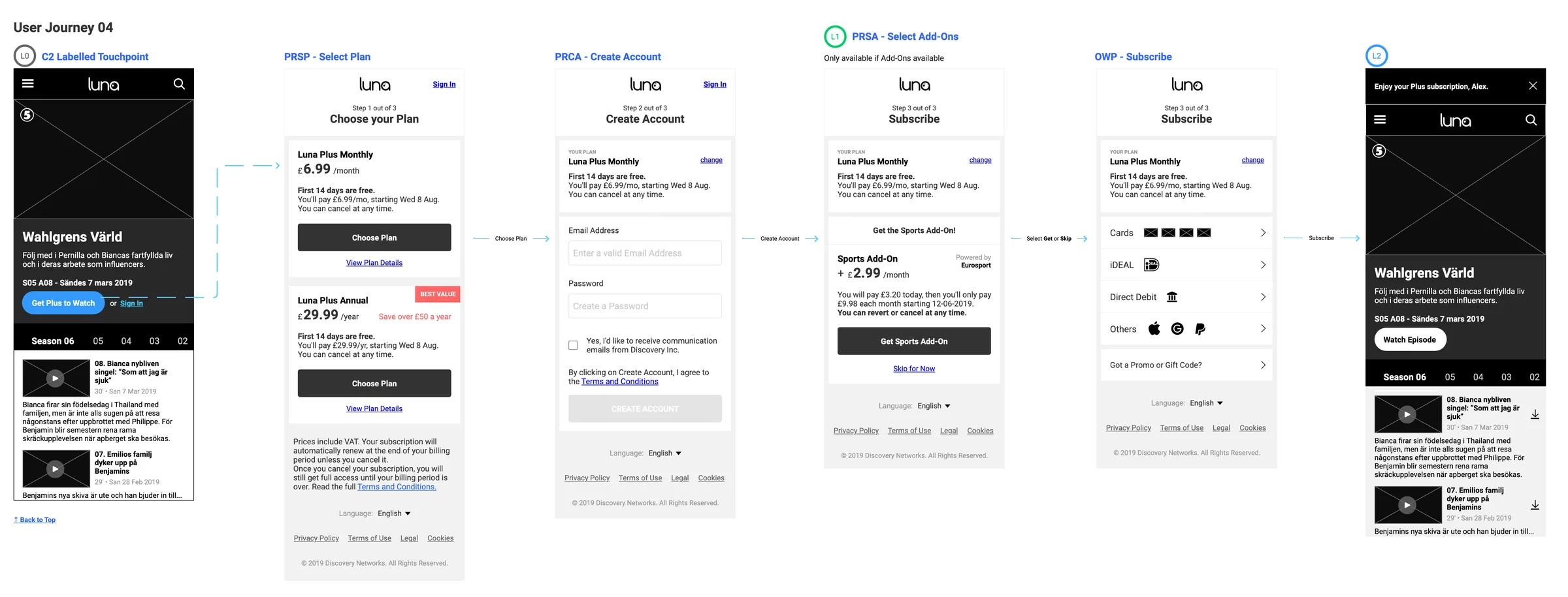
I defined seven user journeys for all three models, by the user’s level and by whether the touchpoint carried an entitlement label. The number of steps depended on the level, from three for an anonymous user choosing a plan down to one for a registered user with a single plan on offer.
Modular journeys, from my 2020 portfolio. In the registration and subscription model shown here, the first journey, for open content, is greyed out. The three models sit at the top with QuestOD, dplay and Eurosport against them, the two recommendations starred.
Open in Figma ↗ Get password →Sign-up ran under a minimal header, without the site navigation I had flagged in the audit. Creating the account granted L1 access straight away, and the profile followed as a second step, with a line saying why the details were needed. Users who dropped out after the first step kept their access and were asked to complete the profile on their next visit. If the email address was already registered, the user was sent to sign in, with Facebook where the account had been created through it.
In the card module I answered the three questions I had raised about the live checkout, with a note that card details are encrypted, a hint for the security code and separate month and year fields for the expiry date, following Baymard’s guidance on expiry dates.
Sign-up, from the spec. Three states of the account step, the check that grants L1 access, then the profile step, in the platform’s neutral placeholder brand. The numbered notes above each screen list every element and its state, down to where the cursor lands on desktop.
Signing in on connected TVs
In July 2019, sign-in on the TV apps was a single page skewed towards Apple TV. By November I had specified seven methods, from credentials and a QR code to a one-time code and a magic link, and each product could pick its methods and their order, landing users on a default method or on a list of options.
I wrote each method as a user story with its requirements and a note on backend support. Sign-in with credentials was fully supported and Facebook sign-in already existed in the previous version, while the other five methods were flagged for the backend team.
QR code sign-in, from the spec. The user story and requirements sit above the flow: polling on the TV, then a welcome back message or an error with a way to try another method. A four-digit code on the same screen is the route for users without the app or a camera.
03Handoff
Handing over to the brand teams
I broke the journeys into self-contained modules and took them through weekly reviews with the design team and the POs, validating them in batches across sprints. The spec was the reference for production and for the UI teams, and exceptions were documented as modules too, for user stories and developer reference.
The Eurosport design team built its UI on the journeys with my guidance where needed, and I amended the documentation from product feedback where a change added flexibility for every product. In December 2019 I documented Eurosport’s web subscription states, from pre-active to terminated, in the same format, with targeted offers that led back into the purchase modules.
Eurosport Player, create account. UI by the Eurosport design team, built on the purchase journeys, from my 2020 portfolio. The step counter and the plan box with its change link match the spec’s modules.
Open in Figma ↗ Get password →Outcome
By my account in 2020, the journeys were the basis of Eurosport Player’s authentication when it moved in-house from an external vendor. On dplay, registration became required before playback, and by the same account registered users rose sharply.
I presented every journey in the spec as an initial recommendation, to be tested before release. Account and playback followed the same process on the platform.
Contact
Get in touch
Product design lead across research, design systems and handover, with coding agents in the loop. Contract, outside IR35, or a permanent lead role.
- Available
- Now
- Location
- London, remote or hybrid, UK and EU
- Right to work
- UK settled status, EU citizen
- RolesLead Product Designer, Principal Product Designer, Design Engineer
- Experience10+ years
- ScopeResearch, design systems, prototyping, handover, QA with agents
- LanguagesEnglish, Italian, Spanish
- Email[email protected]
- LinkedInlinkedin.com/in/dariocodipietro
Professional profile
Copy into your coding agentSkills
- Product design, end to end
- UX and interaction design
- Visual design and motion
- Prototyping in Figma and code
- Design systems at scale
- User research and testing
- A/B testing and analytics
- Strategy and discovery
- AI product design
- Design to code, with agents
- Accessibility, WCAG 2.2 AA
- Leadership and mentoring
Platforms
iOS, Android, responsive web, smart TV and connected devices
Sectors
- AI products
- B2B SaaS
- Consumer apps
- Streaming, media and sport
- Health, wellness and food
- Legal tech
- Telecoms and utilities
Tools
- Figma
- FigJam
- Figma Make
- Claude Design
- Framer
- Axure RP
- Storybook
- Claude Code
- Cursor
- Codex
- MCP
- GitHub
- Linear
- Jira
- Confluence
- Notion
- Miro
- Prolific
- Lyssna
- Maze
- PostHog
- Amplitude