DAZN: NFL Game Pass International
As Lead Product Designer at Perform Group, I designed NFL Game Pass International as a white-label version of DAZN's product, across web, native apps and the living room, to test the platform as a customisable OTT service for sports leagues.
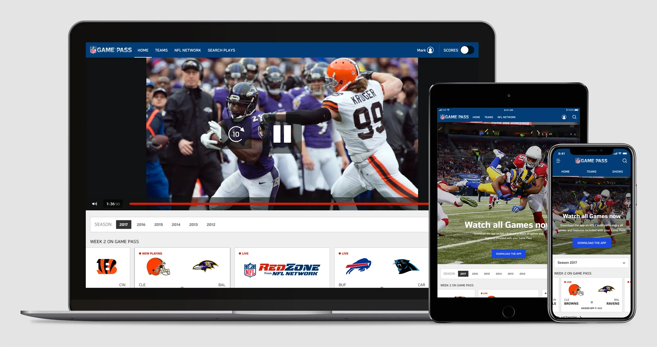
Context
The NFL ran Game Pass as two OTT services, each delivered by a different contractor: Game Pass Europe, and Game Pass International for the rest of the world outside the US and Canada. The contract behind the International service was ending, and Perform Group, which ran DAZN, was approached to deliver a new iteration of it.
For DAZN it was new business, built on its own product as rebuilt in Navigation v2. I covered the UX architecture and the product design with a small product and marketing team, from the third quarter of 2017 into the first quarter of 2018, and designed the full set of UI assets needed for production.
The new Game Pass ran on DAZN’s infrastructure, so I worked closely with the development team to make sure every change the design needed could be built. The NFL season runs for six months in a fixed format, from preseason through the regular season to the playoffs, and the IA and the home had to follow it, where DAZN used one format for every sport. Game Pass also carried a large archive and a linear channel, NFL Network, which DAZN’s product did not have, and both had to be usable and familiar to NFL fans.
Mapping the two Game Pass services
I started from a benchmark of the two services the NFL already ran, mapped signed in and signed out: Game Pass Europe on web, iPhone, Android and Apple TV, and the incumbent International service on the web. Both carried NFL Network and RedZone with a scores toggle, and International also let users search individual plays and follow their teams.
01Architecture
Drawing the IA for four surfaces
From the benchmark, in September 2017 I drew the information architecture for each surface, signed in and signed out: desktop web, mobile web, the native apps and the living room. On desktop, Home autoplayed video above season tabs, with dynamic rails for the current season and archive rails for past ones. Teams opened on a grid of favourites above the AFC and NFC, and NFL Network had live video, a schedule rail and shows A to Z.
Mobile web had the same catalogue without the player, and every video led to a prompt to download the iOS or Android app. The native apps had downloads and a settings area as well. Signed out, the whole catalogue stayed open on the web, with join prompts on each page, and the apps opened on a landing with sign-in, plans and pricing and a join flow.
IA, mobile web, signed in. Account and support sit in a burger menu, and the blue arrows link the footer’s language, account and help entries to the same pages.
From the IA I moved to wireframes, drawn as blueprints from which the product owners wrote their tickets, and as prototypes to test with NFL fans before the visual design.
Ordering the catalogue by the game week
In the catalogue logic I specified in October 2017, the home led with NFL Network on the Wednesday morning of an NFL week, then the coming week’s games. During games, the week’s rail moved to the top, and autoplay switched to the user’s favourite team live, or to RedZone. After the last game, NFL Network led again, above the week’s catch-up and the next week’s games.
Each game tile changed with its game: the date a month out, the kick-off day and time in game week, the kick-off time on the day, then live and final. Before kick-off, selecting a tile played a preview. After kick-off it played the broadcast, and after the final whistle the broadcast with extras.
Previous seasons became VOD archives, from the Super Bowl back to the first preseason week, and the page autoplayed the Super Bowl if nothing else was playing. A Scores switch in the header set every game tile to show or hide its result.
Catalogue logic, home rails. The shading marks what a rail can hold: coming-up tiles only, VOD with live and coming-up games, or VOD only.
Catalogue logic, game tile states. When a tile is the one on screen, its label turns to Playing live, or to Playing once the game is final.
02Design system
Specifying one component set
In the same month I specified the responsive web at five breakpoints, with the breaks at 600, 900, 1,200 and 1,800 pixels set from a breakdown of device widths, and drew the header, footer, season filter and tiles for each. On a phone the header held tabs for Home, Teams and Shows, the account joined from 600 pixels, and Search plays and the Scores switch from 900.
The components sat in Sketch symbol libraries, organised as atomic design, with shared libraries of atoms, logos, teams and tiles, and libraries of headers, tabs, playback and footers for each platform. A team sheet held each club’s host and guest logos and its primary and secondary colours, and every team tile carried its colour in one corner. The palette was set by area, with Game Pass blue in the header only, Live Red for anything live, and Active Blue for selection and calls to action.
The NFL had no design guidelines or system to give us at the start, though we asked for them. Its component-based design system arrived as a Sketch file well into the job, and had to be ported into every design delivered by then. It was a painful process, but with symbol libraries already in place on every platform the changes were easier than they would have been a few months earlier.
Shared library, tiles. With scores on, the losing side of a game tile fades back, and the tile now playing takes a blue underline.
Planning the build
In the UX plan, drawn up in November 2017, I put the responsive web first, from October to mid-January, then the iOS and Android apps side by side for six weeks, with Chromecast and AirPlay, and the living room from March: Android TV, Amazon Fire TV, Xbox One and Apple TV.
UX plan, November 2017. On the web, the landing page, sign-in and sign-up came last, in December and January, after the catalogue, playback, account and help.
In December 2017 I put the strategy and the design of each surface into a product vision deck, and proposed splitting the build by domain: one layer of assets shared across the product, then catalogue, playback, sign-up and account, each going to its own front-end team.
Product vision deck, delivery by domain. Each team receives the shared layer alongside its own domain, both through AWS.
03Surfaces
Designing the web and the apps
I took the responsive web to version 1.03, with the catalogue, dialogues, a sticky player, the account area and HTML page templates. I prototyped rail behaviour, scrolling at each breakpoint and the video player in Framer. The stakeholder demos for tablet and mobile date from late October.
Product vision deck, NFL Network. The TV guide rail opens on the show now playing, then the evening’s schedule, with featured videos from the network’s shows below it.
On the web the player had a state for each kind of video: a live game, the same game behind the live point, a game on demand in broadcast, condensed or coaches film, and NFL Network live or on demand.
Playback states, web. Behind the live point the controls add a 10-second skip forward, and Live becomes a button that returns to it. In coaches film the timeline marks the plays, and a marker shows a thumbnail and the play-by-play text.
I took the iOS and Android apps to version 1.01, each with its own libraries for headers, tabs and playback. On iOS the tab bar held Home, Teams, Shows, Search and More, and each game could be played as the broadcast, the coaches film, a condensed version or audio, then downloaded or sent to AirPlay. Play search filtered by player, play type, down, team, week and season, and listed each play with its game clock, down and distance, and the play-by-play text.
The Android app. The home during a live game, the Atlanta Falcons team page and NFL Network, each with a bottom bar of Home, Teams, Shows and Search.
Designing the 10-foot UI
The TV apps opened on the first game in Games playing full screen, and navigation ran on the D-pad: up for the top menu, left and right for the previous and next video in the rail, OK for the controls and the current rail, and down for the rails. Signed out, the same screen showed a promo and a sign-in, by quick code or username and password, with a QR code from the app as an open question. New customers were pointed to the web or the app to join.
IA, living room, signed in. Team and show pages open with a banner, title and info above their rails, and the seasons rail leads to a season archive.
The Framer prototype I built in December 2017 ran from a keyboard or a game controller, with rails over the live game, a menu rail, and an overlay that faded after three seconds without input. The living-room catalogue followed in February 2018, drawn as Apple TV screens.
The living-room catalogue. The game plays full screen behind the week’s rail, where its own tile reads Now playing, with NFL Network in the rail below.
What was handed over, and what was still planned
Planned, not reached
- Android TV
- Amazon Fire TV
- Xbox One
Handed over
- Responsive web, version 1.03
- iOS and Android apps, version 1.01
- Web specs and the catalogue logic
- Shared libraries: atoms, logos, teams, tiles
- Living-room catalogue and the Framer TV prototype
- Sign-up flow and landing page changes
The three platforms on the left shared the plan’s last block with Apple TV, from March 2018, and have no designs in the handover.
Outcome
By my account in 2020, testing had started when the contract fell through, and this iteration of Game Pass International did not launch. The full set of UI assets for production had been handed over by then.
I specified the web first, and by the handover its specs and libraries had been reused for the native apps and the TV. The living-room libraries began as copies of the web ones, with a menu tile and focus states added to the tiles.
Contact
Get in touch
Product design lead across research, design systems and handover, with coding agents in the loop. Contract, outside IR35, or a permanent lead role.
- Available
- Now
- Location
- London, remote or hybrid, UK and EU
- Right to work
- UK settled status, EU citizen
- RolesLead Product Designer, Principal Product Designer, Design Engineer
- Experience10+ years
- ScopeResearch, design systems, prototyping, handover, QA with agents
- LanguagesEnglish, Italian, Spanish
- Email[email protected]
- LinkedInlinkedin.com/in/dariocodipietro
Professional profile
Copy into your coding agentSkills
- Product design, end to end
- UX and interaction design
- Visual design and motion
- Prototyping in Figma and code
- Design systems at scale
- User research and testing
- A/B testing and analytics
- Strategy and discovery
- AI product design
- Design to code, with agents
- Accessibility, WCAG 2.2 AA
- Leadership and mentoring
Platforms
iOS, Android, responsive web, smart TV and connected devices
Sectors
- AI products
- B2B SaaS
- Consumer apps
- Streaming, media and sport
- Health, wellness and food
- Legal tech
- Telecoms and utilities
Tools
- Figma
- FigJam
- Figma Make
- Claude Design
- Framer
- Axure RP
- Storybook
- Claude Code
- Cursor
- Codex
- MCP
- GitHub
- Linear
- Jira
- Confluence
- Notion
- Miro
- Prolific
- Lyssna
- Maze
- PostHog
- Amplitude