Samsung Food: Planner Improvements
As Lead Product Designer at Samsung Food, I ran the planner improvements workstream alongside the casual planner and the Tailored Plan: five briefs under one mission, each taken from hypothesis through triad and design review to a ready-for-dev handover.
Context
Between the casual planner and the Tailored Plan sat a run of smaller briefs on the same surface, grouped in Figma as Meal Plan Improvements under one mission: the planner and its recommendations should reflect the way users actually eat and plan. Each brief had its own file, its own hypothesis, and its own handover, and each one fed the two larger workstreams on either side of it.
The method was the same at every size. One page per iteration, opening with an overview block: the mission, the solution line from the roadmap, who is reviewing, what changed since the last iteration, what feedback is wanted. Questions to reviewers pinned beside the screens they concern. The PO’s pushback written on the board, not in a call, so it could be answered on the board. A dev-ready page that carries only the release scope.
01Quick wins
Real estate and natural language
The first brief was a usability pass on the calendar view with three aims written at the top of the page: increase vertical real estate, use natural language where possible, and let users collapse the recommendation row. The header went to one line, top and bottom padding to 16, headings to H4, line dividers removed. Day labels became yesterday, today and tomorrow, and the week picker listed last week, this week and next week before it listed dates. The tailored row became collapsible, and its state persisted. Released as part of the calendar view update in v1.
Quick wins. Each amend is a tag on the screen: one-line header, padding to 16, headings to H4, dividers removed, natural language in the week picker and the day view.
Open in Figma ↗ Get password →02Recipe and product combos
New meal cards
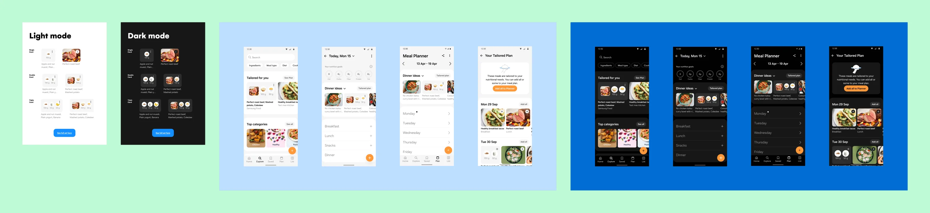
The roadmap solution was recipe and product combos for lunch and dinner: more and new food combinations in recommendations, so that a planned meal could be a recipe plus sides or products, not a recipe alone. The cards had to carry two, three or four items where the existing card carried one. Iteration 1 put three directions on the board, stacked, tiled and single card, with the existing two-product card as the baseline and a note that the database images had white backgrounds, which ruled out anything that relied on cut-outs.
Iteration 2 settled on the single card after design review and a review with the PO, in three variants and both themes, and opened a second question: a quick view bottomsheet, so users could inspect and edit a combo without leaving the planner, against a dedicated combo page. The PO’s position was on the board. Two radically different views for different types of meals would add mental complexity; consider a unified system for combos and recipes, and think about how a saved combo is opened from the recipe box before building a quick view that then needs a page as well. My case for quick view was also there: it keeps users on task, and there was research supporting it in visually driven products.
Iteration 1, three directions. Existing, new and future-proofing combinations against stacked, tiled and single card layouts. The four-item rows are marked future proofing and were not in scope.
Open in Figma ↗ Get password →Iteration 3, the PO on the board. Quick view against a page, and the argument for one interaction model for combos and recipes. Written on the canvas so it could be answered there.
Open in Figma ↗ Get password →Iteration 4, the question put to review. Quick view keeps users on task; a page is one pattern for every meal. Both journeys on the board with the arguments beside them.
Open in Figma ↗ Get password →Settling the card and the view
Iteration 4 took the question to the wider design review with four asks: which single card variant, quick view or page, whether combo actions should be contextual and change between recommended and planned, and whether users should be able to swap a single item inside a combo. Design and product had mostly settled on variant 1; the review confirmed it. The quick view was kept for the planner context and put to an A/B against the existing overflow menu with a simplified add-to-shopping journey, so the decision would rest on data rather than on the two positions.
One card component for every combination. Single, double and triple cards share the component the new combo cards use, so the old single and double cards were deprecated in the same handover rather than maintained beside them.
Release scope held to the recommendation row, the tailored plan and explore, and the add journeys from each. Quick view went to A/B; swap-in-combo and contextual actions were parked for the Tailored Plan, where they were later built as swap.
Iteration 4, design review. Four questions on one page, each with its journeys. The bottom row is swap-in-combo, which came back in the Tailored Plan as swap.
Open in Figma ↗ Get password →A/B of the quick view. The existing menu, simplified, against the bottomsheet. The test was set up at handover; the result is not on the board.
Open in Figma ↗ Get password →03Notes
Parity with the web app
The brief was alignment: the web app could add one note per day to the planner, native could not. Iteration 2 covered the shared plan case (a flatmate’s note visible on a shared plan), adding a note from the FAB with the first available day preselected, switching to the week the note lands in, and the conflict when a day already has a note: a modal offering to edit the existing one, with the typed text persisting across a date change. Iteration 3 produced every journey after a tech call, rebuilt on the One UI components, in light and dark. Ready for dev the same week. The web app’s own announcement states the constraint the native work matched: one note per day, up to 80 characters.
Notes, iteration 3. Add from the FAB, add to a day with a note, delete, and the unsaved prompt, in both themes. The overview block records that it followed the tech call.
Open in Figma ↗ Get password →04Personalised servings
Fractional servings from nutrition targets
The hypothesis on the brief: the tailored plan’s utility is limited by the recipe pool, because recipes are picked at their defined servings and many miss a user’s nutrition targets by that fixed amount. Adapting servings fractionally to the user’s targets would widen the pool without changing the recipes. Iteration 1 asked two questions, does this make sense and do you see personalised servings anywhere else, and put the recommendation on the recipe page: we recommend 0.75 servings for you, with a set-recommended action. Iteration 3 narrowed to two variants: personalised servings as the default with original as a toggle, or original as the default with personalised offered. Entry from anywhere and from the planner were both designed. Handed over; released after I left.
Servings, iteration 1. The hypothesis and the why at the top, the servings control in three variants, and the questions: does it make sense, which works best, where else.
Open in Figma ↗ Get password →Servings, iteration 3. Variant A recommends and sets; variant B toggles personalised against original. Both entries, from anywhere and from a planned meal.
Open in Figma ↗ Get password →05Leftovers
Leftovers as a collection or a list
Leftovers entered through made it: when a meal is marked made, how many leftover portions did you get, and where to plan them. Iteration 1 put two models side by side. A leftovers collection, created when a plan is generated, populated automatically and reachable from the collections screens; or a leftovers list, available only from the planner and not from collections. The question on the board was whether there was any value in not using a collection. Iteration 2 designed leftovers as a saved collection, opening a plan screen from the collection. The Tailored Plan’s cooks-per-week setting is what makes the count meaningful: fewer cooks, more leftovers planned. Handed over; released after I left.
Leftovers, iteration 1. Collection on the left, list on the right, the same journeys under each. The yellow note asks whether there is value in not using a collection.
Open in Figma ↗ Get password →Made it. Portions captured at the moment a meal is marked made, then planned. The entry point every leftover model shares.
Open in Figma ↗ Get password →What each brief handed over
Parked
- Four-item combo cards
- Dedicated combo page
- Contextual combo actions
- Swap an item inside a combo
- More than one note per day
- Leftovers list outside collections
Handed over
- Calendar view quick wins, in v1
- Single, double and triple combo cards, one component
- Combo cards in recommendations, tailored plan and explore
- Quick view bottomsheet, to A/B
- Notes on native, one per day, parity with web
- Personalised servings, two variants
- Leftovers as a saved collection
Quick wins, combo cards and notes were released while I was there. Servings and leftovers were handed over and released after I left, as the Tailored Plan drew on both.
Outcome
Five briefs went from hypothesis to handover on the same method, and three were released in the period: the calendar view quick wins, the combo cards across recommendations, tailored plan and explore, and notes on native. The other two were built into the Tailored Plan, where cooks-per-week plans leftovers and personalised servings widen the recipe pool the plan draws from. The mission line held across all five: the planner reflecting how users eat, one brief at a time.
None of these was a large project on its own, and that was the point of running them as one workstream. The same page structure, the same review questions and the same handover format meant a brief could be picked up, reviewed and handed over inside a sprint, and the two larger projects on either side inherited components and decisions rather than remaking them.
Contact
Get in touch
Product design lead across research, design systems and handover, with coding agents in the loop. Contract, outside IR35, or a permanent lead role.
- Available
- Now
- Location
- London, remote or hybrid, UK and EU
- Right to work
- UK settled status, EU citizen
- RolesLead Product Designer, Principal Product Designer, Design Engineer
- ScopeResearch, design systems, prototyping, handover, QA with agents
- Email[email protected]
- LinkedInlinkedin.com/in/dariocodipietro