Samsung Food: Health Dashboard
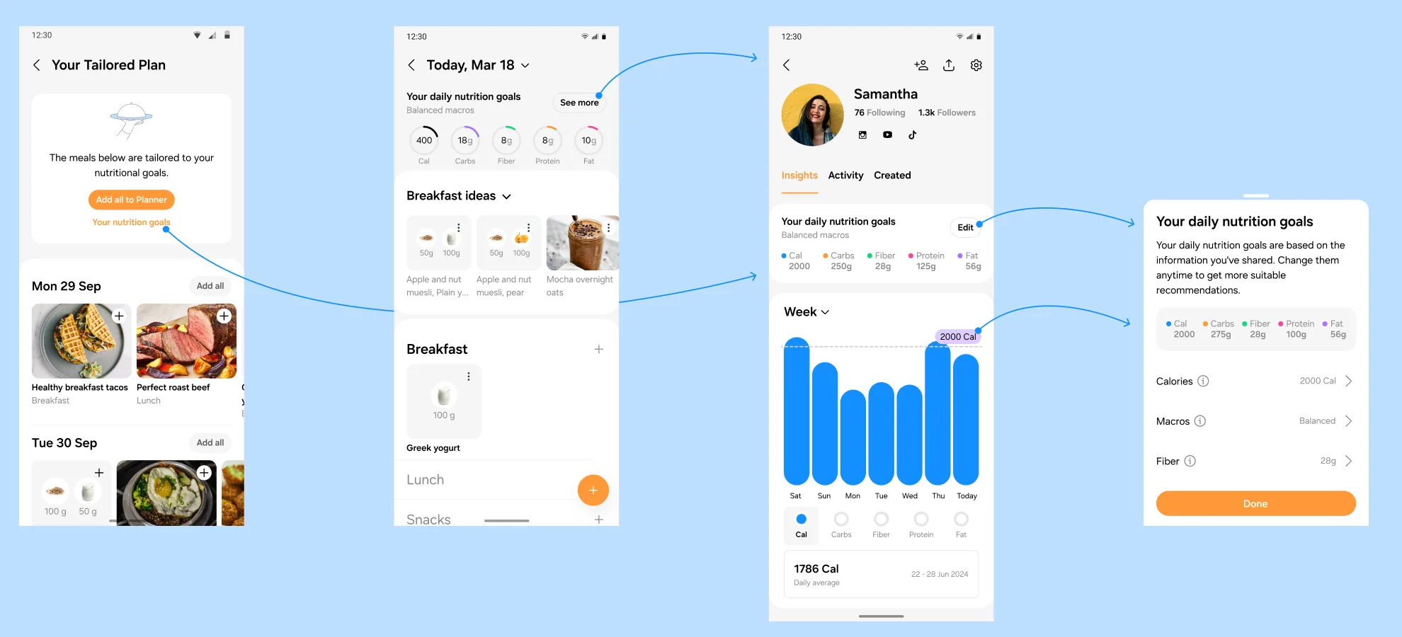
As Lead Product Designer at Samsung Food, I designed the first health dashboard for the app, to move it from a recipe tool towards the wellness side of the Samsung ecosystem.
Context
Engagement in Samsung Food stopped at recipe discovery and planning: no retention loop beyond them, and the app positioned as a consumer food tool.
The goal was to integrate Samsung wearable data with our food database across the app lifecycle, from meal discovery to planning to the profile, to create a positive engagement loop.
Mapping the brief
Food tracking was about to land in the app. Tracking and meal planning were separate workstreams I was leading in parallel; this one picked up where they ended. Once we hold a user’s intake data, how do we return value on it and sustain a healthy habit loop?
I started by mapping the brief to experiences. Each objective (foster engagement, align inspiration with goals, celebrate milestones) became a candidate experience (consumption over time, guidance where habits fall short, badges), and each experience became a set of concrete ideas. The mapping stayed at the top of the first iteration for the whole of round one, so every screen on the board traced back to an objective.
Round one, first iteration. Brief-to-experience mapping top centre, Samsung Health summary and exercise screens as the reference on the right. PO notes are already on the board, including the open question of where the dashboard lives: profile, home, or a kitchen tab.
Open in Figma ↗ Get password →01Round one
The inferred score
Round one focused on meal plan and profile integration. The primary metric was an inferred nutrition score: a single ring on the profile with a qualitative verdict (“You can do better”) and a line of guidance. Below it, last week’s meals tagged by inferred deficit (low fibre, high fat), and recommended meals selected to move the score.
Around it we explored quick views, placement across the app, and home feed modules: tracking helpers, nutrition-based suggestions, post-workout ideas, trend and goal cards, achievements and streaks. Some of the gamification patterns were borrowed from Samsung Health, where quantified energy saving had performed well.
How the iteration ran
Each iteration is one Figma page, reviewed with the product triad (PO, dev, design), and the next iteration builds on the outcome. Iterations labelled DR were design reviews with the wider team. Each DR opened with a structured ask: what you like and do not want removed, questions, what you would improve, in that order. It kept feedback actionable and kept reviews from collapsing into taste.
Round one, design review. The iteration reads top to bottom as a walkthrough. Each block carries its own question for reviewers: which dial design, what is missing, where it should live, which module delivers the most value and the strongest habit nudge.
Open in Figma ↗ Get password →Round one, last iteration. The score ring worked through its states, with the first weekly bar charts on the right. The bars are what survived.
Open in Figma ↗ Get password →Concept tests
I run user research across the full design process, with two distinct purposes.
InformWhere POs disagree or are undecided on direction, research gives them evidence to decide on.
ValidateOnce direction is agreed, research checks that the solution holds up with users.
This round was to inform. We ran moderated interviews with our own users; in each session the researcher showed several concepts for the same feature and probed what worked, what was confusing, and what was missing. I built the concept boards and the prototypes used in the sessions.
Concept prototype. The screen shown in interviews. The full proposition is on it: one score, its explanation, the meals behind it, and the meals that would correct it. Everything below the ring depends on inference.
Concept boards ↗Play the prototype ↗ Get password →Descoping to hard metrics
The concept tests surfaced something the plan had not anticipated: the POs disagreed on what should power the main user-facing metric. It had been scoped and designed as an inferred score, but there was no agreed answer to the question beneath it: inferred from which inputs, by which model, and who owns that model.
An inferred metric that cannot explain itself is a liability on a health surface. If you cannot state why a user got “You can do better”, you cannot ship it.
We agreed with the POs to descope. Phase one would show hard metrics only: calories and macros against goals, no inference layer. The score, the verdicts and the score-driven recommendations were parked, not cut, pending an agreed model.
This is the decision I would point to if asked what the lead role added here. The design work held up. Descoping most of it and shipping the hard-metric version first is what got the feature released.
02Round two
Trends
Round two took the simpler approach with the nearer win: nutrition and meal trends on the profile, so users can read their progress over time. Apple Fitness trends were the reference. Weekly bars per macro, a goal line, and a trend row beneath (carbs, protein, fat, fibre, meals tracked, meals planned).
The open question was chart form. Bars were already in delivery as part of dashboard improvements; rings were closer to Samsung Health. I put both on the board in light and dark and asked the team directly: is moving to rings worth the effort, and should both ship with a user toggle? Three chart variants went to users to answer the first part.
Bars or rings. The same profile in both chart forms and both themes, with the question to the team alongside.
Open in Figma ↗ Get password →Round two, design review. Below the chart question: four treatments for goals against actuals, and a strip of AI-generated recommendations for Premium, with the caveat that they only earn their place once tied to a real diet score.
Open in Figma ↗ Get password →The final iteration in this cycle is the post-DR pass, with feedback from the wider team and the Samsung Health team incorporated. It also carried the first treatment of the Plus subscription inside the trends page, kept clear of the free view.
Round two, final agreed designs. Post design review with the wider team, including Samsung Health. Ring and bar variants, the goals grid, and the Plus prompt at the bottom.
Open in Figma ↗ Get password →Usability and comprehension
Once direction was agreed, the designs went back to users to validate. Moderated usability and comprehension sessions: can users read the chart, do they understand the goal line, do they know the next action. I supported the researcher in building the tasks and the studies.
03Handoff
Into the design system
The agreed designs were rebuilt as design system components and mapped into ready-for-dev iterations, reviewed and iterated with engineering. Handoff iterations document components by state rather than happy-path screens: the weekly progress card with one macro and with all macros, goals set and unset, empty, loading, and the upsell. The feature was split out of the wider Food Diary Dashboard work and taken through three product and dev sprints.
Handoff, nutrition progress. Marked ready for dev. Top row rings, middle row stacked bars, bottom row single macro. The bottom row shipped.
Open in Figma ↗ Get password →Handoff, macros. One macro at a time, calories through fat, with the goal line and the daily average. This is the component that shipped.
Open in Figma ↗ Get password →Handoff, empty state. The same card with no tracked data at each timeframe. States are documented before happy paths.
Open in Figma ↗ Get password →Round one, first screen. Score, streaks, achievements, weekly summary, recommendations. Almost none of it reached handoff.
Open in Figma ↗ Get password →Handoff, the shipped dashboard. Goals, one chart, one selector, one number. Everything on it comes from data the user entered.
Open in Figma ↗ Get password →What was cut, and what shipped
Round one
- Nutrition score ring with a verdict
- Inferred tags on each meal
- Meals recommended to move the score
- Achievements, streaks, badges
- Home feed modules and quick views
- Placement across the whole app
Shipped
- Weekly progress card on the profile
- Bars per macro against a goal
- Trend row: carbs, protein, fat, fibre, meals
- Goal setting, and the no-goal state
- Empty and loading states
- Plus upsell, out of the way of the free view
Every cut had the same rationale. Everything on the left depended on an inference model the team had not agreed. Everything on the right depended only on data the user had already entered.
Outcome
After the feature shipped, wellness became a core part of the Samsung Food experience, with strong user adoption. The profile dashboard was the first piece of it to reach users. By IFA 2024 Samsung was describing Food+ as “integrating a health profile and goals, providing personalized meal plans with recipe recommendations”, and the meal planner page still leads with weekly progress: see what is working and what is not.
The final iteration looks nothing like the first, and that is not a failure of the first idea. Round one existed to find out what the team actually agreed on, and the answer was less than assumed. Design is a decision process before it is a production process; the artefacts are how you find out which decisions are still open.
Contact
Get in touch
Product design lead across research, design systems and handover, with coding agents in the loop. Contract, outside IR35, or a permanent lead role.
- Available
- Now
- Location
- London, remote or hybrid, UK and EU
- Right to work
- UK settled status, EU citizen
- RolesLead Product Designer, Principal Product Designer, Design Engineer
- ScopeResearch, design systems, prototyping, handover, QA with agents
- Email[email protected]
- LinkedInlinkedin.com/in/dariocodipietro